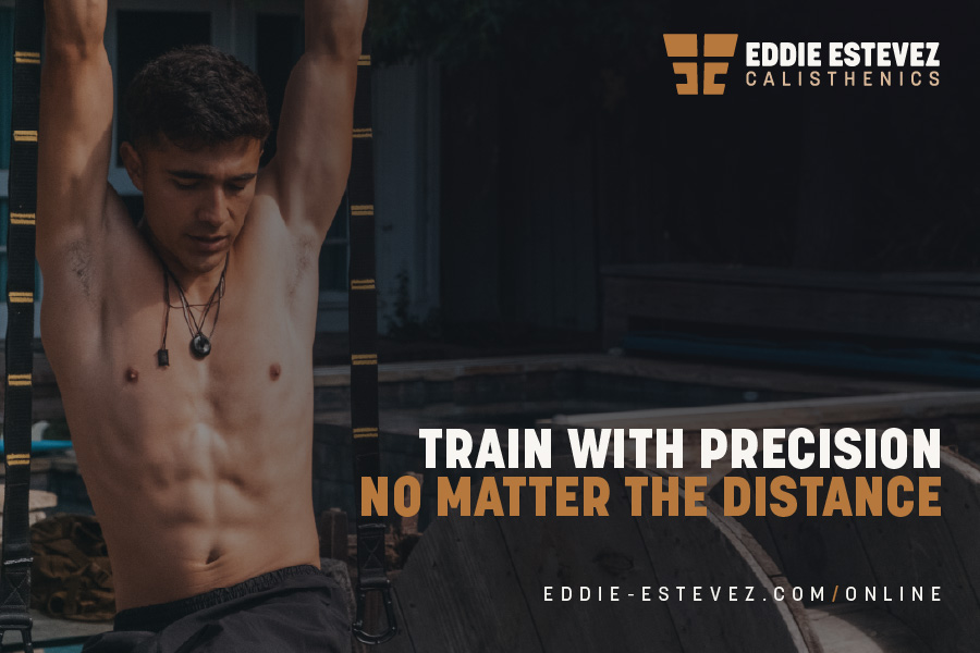
Brand OVERVIEW
For Eddie Estevez, calisthenics is more than just a workout; it’s a transformative art form that merges strength, creativity, and a connection to self.
His brand is about inspiring men aged 18-29 to break free from the gym stereotypes and embrace an innovative, empowering form of fitness.
The branding had to reflect this ethos of growth, creativity, and resilience while being flexible for Eddie’s current in-person and virtual training services and his future gym aspirations.
The result? A brand identity as strong and adaptable as the workouts themselves.
Eddie Estevez positions himself as the guide in each client’s journey to break boundaries and achieve unparalleled strength and creativity. Clients become heroes in their own transformative stories, while Eddie’s expertise and brand act as the firm, yet supportive guide.
Design Solution
The EE monogram wasn’t just about creating a logo—it was about carving a symbol of strength and transformation.
Drawing inspiration from the Golden Ratio, the bottom edge scales down, evoking the shape of a male torso in a powerful yet fluid stance. The upward growth inherent in the design mirrors the evolution and discipline found in calisthenics training.
It's worth noting that the Ancient Greeks not only used the Golden Ratio frequently but also had a direct impact on the foundation of calisthenics.
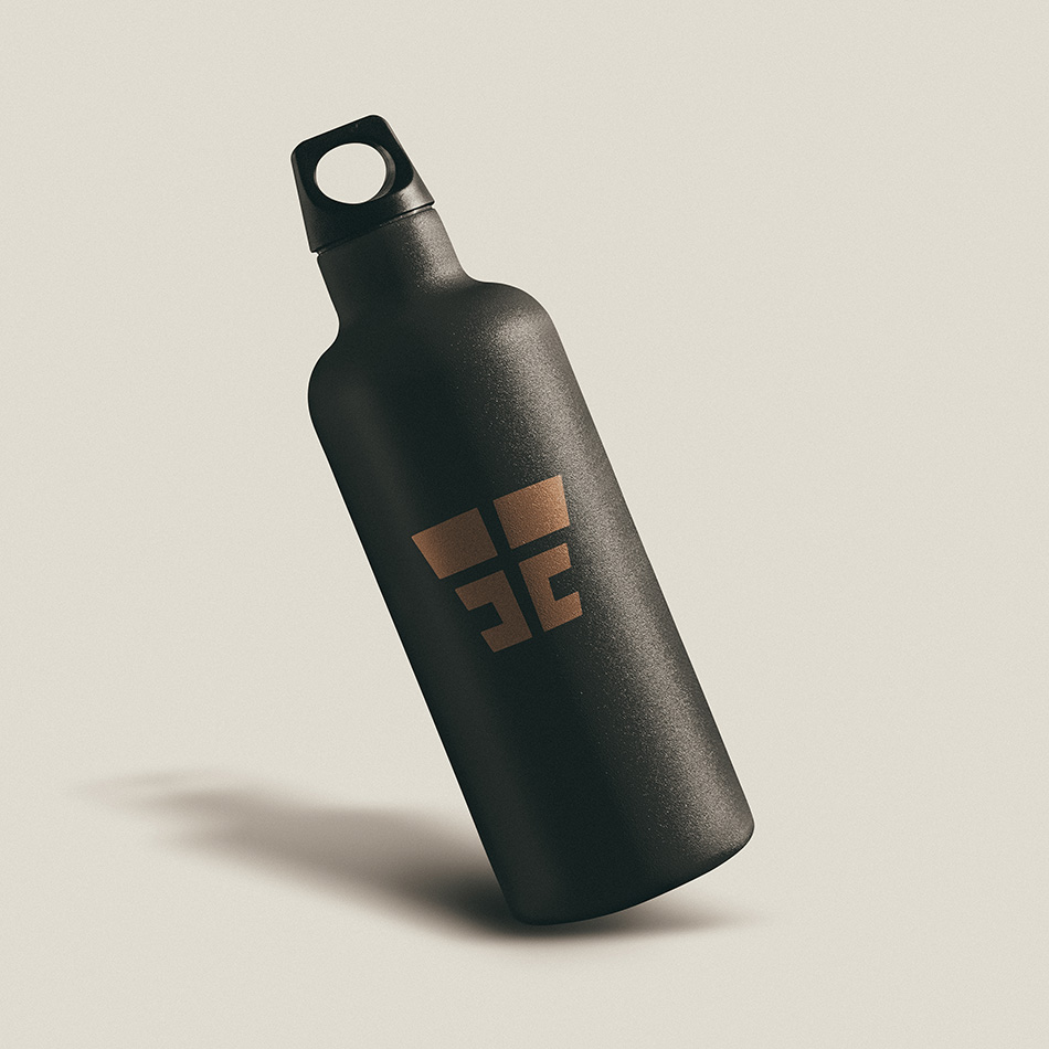
By gently rounding the monogram’s corners and using Korolev, a versatile sans-serif, the brand conveys a balance of strength and approachability. The typeface’s flexibility across weights and sizes lends itself to digital and print mediums, ensuring the brand remains impactful on social media, merchandise, and signage.
The color palette was inspired by the contrasting landscapes of Venice Beach—capturing both the vibrant spirit of the beachfront culture and the muted, gritty undertones of urban settings. This unique blend evokes energy and grit, a nod to Eddie’s blend of toughness and creativity in his workouts.