project overview
In 2021, I joined the Snap Design Academy and tackled a design challenge for Snap Inc., focusing on elevating digital safety awareness for both Snapchat employees and users. This challenge allowed me to dive deep into Snap’s brand universe, working within their guidelines to create a visually cohesive campaign that underscores Snap’s commitment to “Safety by Design.”
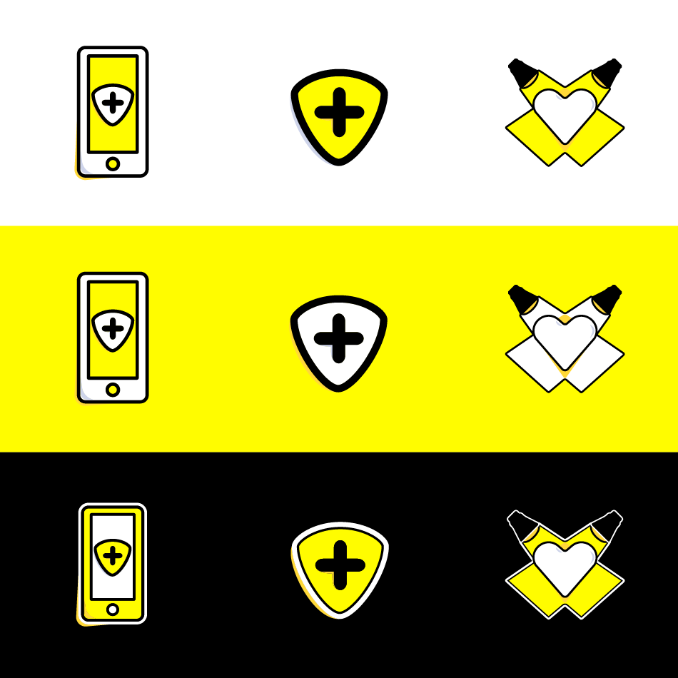
Throughout the project, I developed a suite of icons that seamlessly integrates into Snap's digital and print ecosystems. The icons were crafted to reflect the simplicity and accessibility central to Snap’s brand, while being versatile enough for applications ranging from internal presentations to large-format posters. This flexibility speaks to their utility across different media and enhances Snap's mission to create a safer digital environment.
Throughout the project, I developed a suite of icons that seamlessly integrates into Snap's digital and print ecosystems. The icons were crafted to reflect the simplicity and accessibility central to Snap’s brand, while being versatile enough for applications ranging from internal presentations to large-format posters. This flexibility speaks to their utility across different media and enhances Snap's mission to create a safer digital environment.


Design solution
To reinforce Snap's safety initiatives, I created a set of custom icons inspired by both the platform’s visual language and safety symbols that intuitively communicate protection and security. These icons are scalable and adaptable, ensuring clarity whether viewed on a mobile screen or a large conference slide.
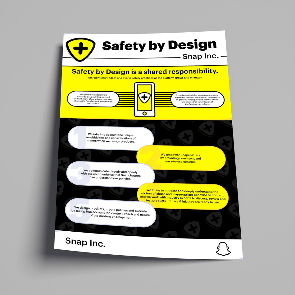
The poster and slide deck were designed to demonstrate these icons in real-world applications, blending Snap's iconic yellow with a sleek, professional layout that keeps the content engaging but informative. The clean lines and high contrast within the icons maintain Snap's playful yet direct tone, making the safety message approachable but clear.
By aligning the iconography with Snap’s core aesthetic, I contributed to a cohesive narrative that keeps user safety front and center across all touchpoints.
